RFC Max Stage Analysis
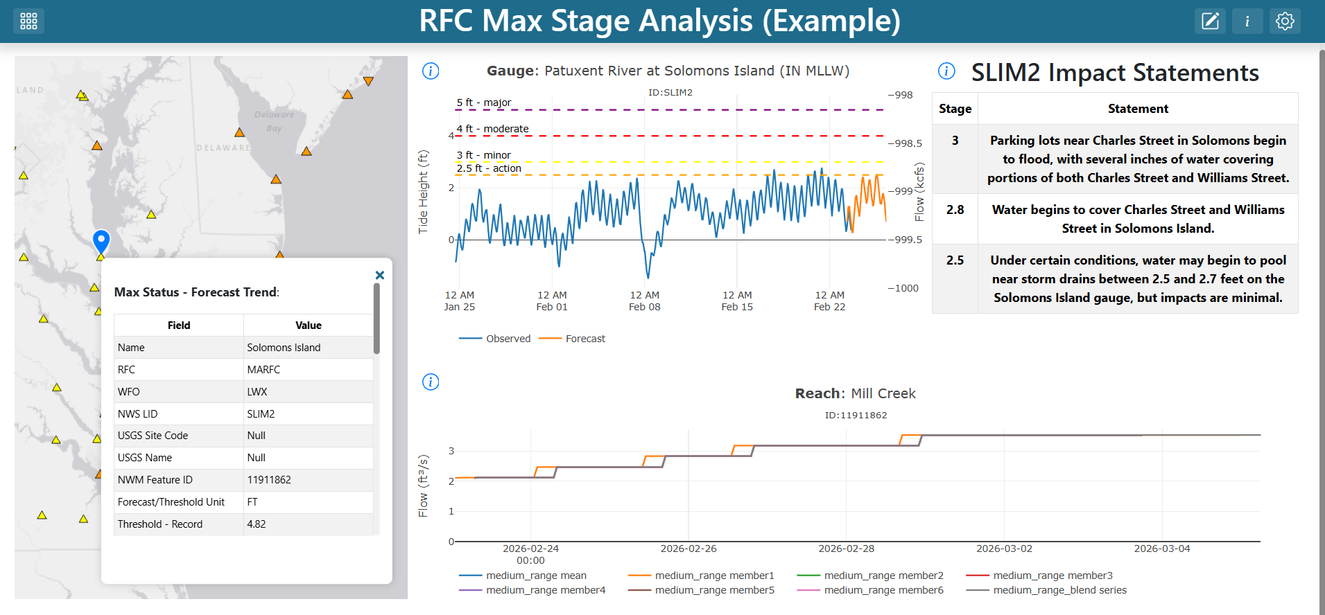
This tutorial walks through building a complete dashboard that combines a map of river gauges with dynamic time series and impact statements. Selecting a gauge on the map updates every other visualization on the dashboard — a common pattern for water-management dashboards that pull together data from multiple sources.
Finished product: https://demo.tethysgeoscience.org/apps/tethysdash/dashboard/42cbbe40-140f-4b9b-965c-99199cbf2c57
What you will build
A single dashboard containing:
A map of RFC maximum-forecast gauges
A gauge time series hydrograph tied to the gauge selected on the map
Impact statements describing what each water level means at the selected gauge
A streamflow forecast (NWMP Reaches Time Series) for the reach associated with the selected gauge
Two variable inputs (
LIDandFeature) that connect the map to the other visualizations
Prerequisites
Before starting you should be comfortable with:
The TethysDash landing page (see Landing Page)
Creating and editing dashboard items (see Editing Dashboards)
Variable inputs (see Variable Inputs)
Maps (see Maps)
You must also have the following plugin packages installed as TethysDash dependencies:
ciroh_plugins — provides the
NWMP Gauges Time SeriesandNWMP Reaches Time Seriesvisualizationstethysdash_plugin_cnrfc — provides the
Impact Statementsvisualization
Step 1 — Create the dashboard
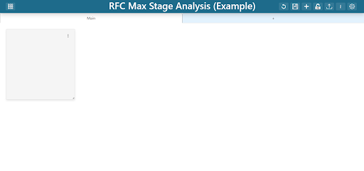
From the TethysDash landing page, create a new dashboard named “RFC Max Stage Analysis” and give it a short description. Open it, then click Edit Dashboard in the upper-right corner to enter edit mode.
Step 2 — Add the RFC Max Forecast map
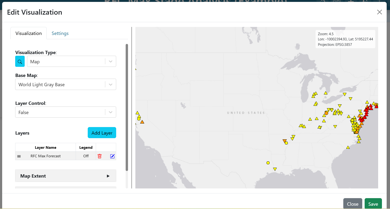
An empty dashboard item appears when you enter edit mode. Click the three dots on the item to open its editor, then configure it as a map:
Visualization Type:
MapBase Map:
World Light Gray BaseLayer Control:
False(users won’t toggle layers)
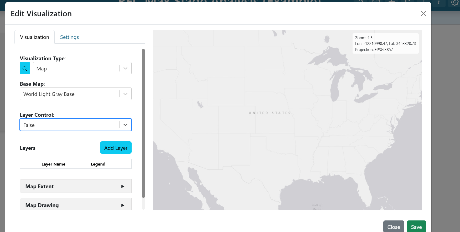
Click Add Layer and configure the new layer:
Name:
RFC Max ForecastDefault visibility: visible
Source tab → Source:
ESRI Image and Map ServiceURL:
https://maps.water.noaa.gov/server/rest/services/rfc/rfc_max_forecast/MapServer
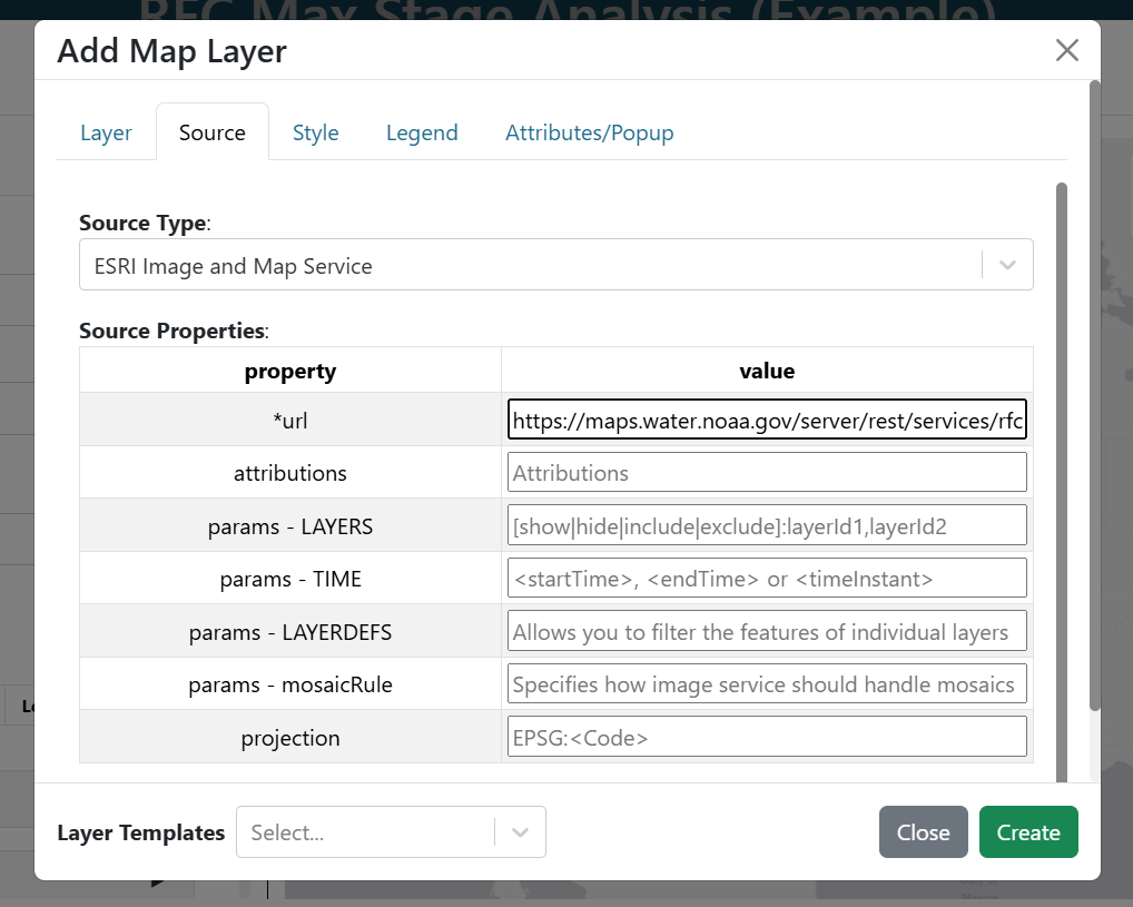
Skip the Style and Legends tabs. On the Attributes/Popup tab the attribute list is auto-populated — leave the defaults for now; you will come back here to add variable inputs in later steps. Click Create to finish the layer.
Zoom into Maryland, then expand Map Extent and choose Use the Previewed Map Extent to save the current view as the default.
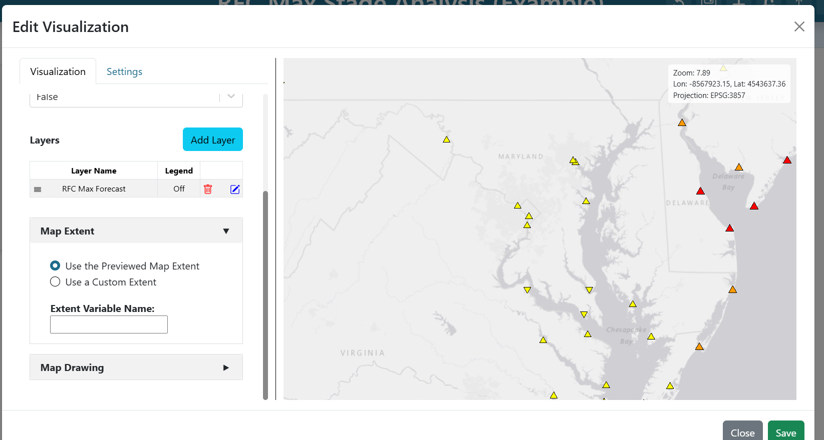
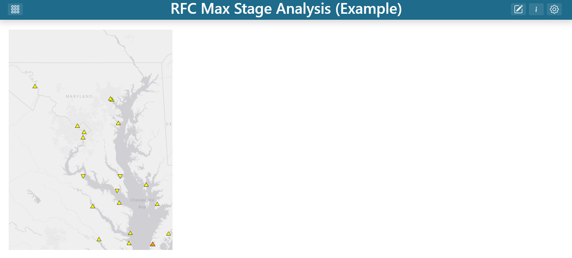
Click Save on the map editor, resize the map to fill the left third of the dashboard, and save the dashboard to preserve your progress.
Step 3 — Create the LID variable input
The gauge time series and impact statements both need a gauge identifier. Rather than hard-coding one, connect them to the map via a variable input.
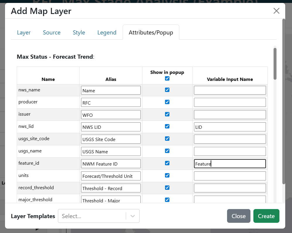
Re-enter edit mode, open the map, and edit the RFC Max Forecast layer. On the Attributes/Popup tab, find the nws_lid row and set its Variable Input Name to LID. Whatever gauge a user clicks on the map, its nws_lid value now becomes the value of the LID variable input.

Save the layer and the map.
Step 4 — Add the gauge hydrograph
Add a new dashboard item and edit it:
Visualization Type:
NWMP Gauges Time SeriesId:
${LID}
The ${LID} template tells the visualization to read from the variable input you just created. When the user clicks a gauge on the map, the chart automatically re-fetches.
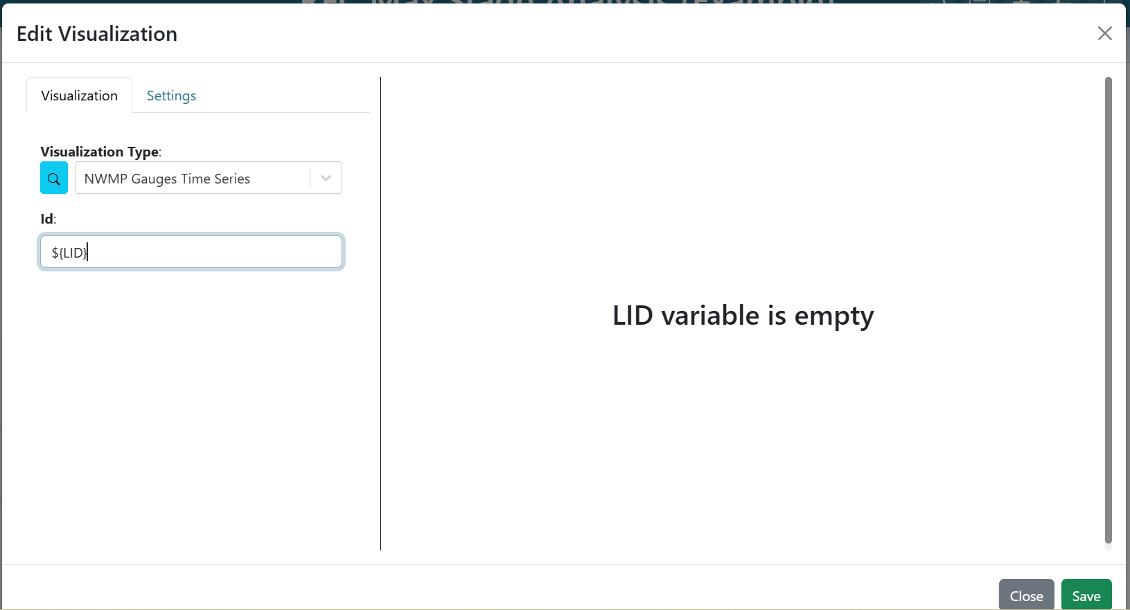
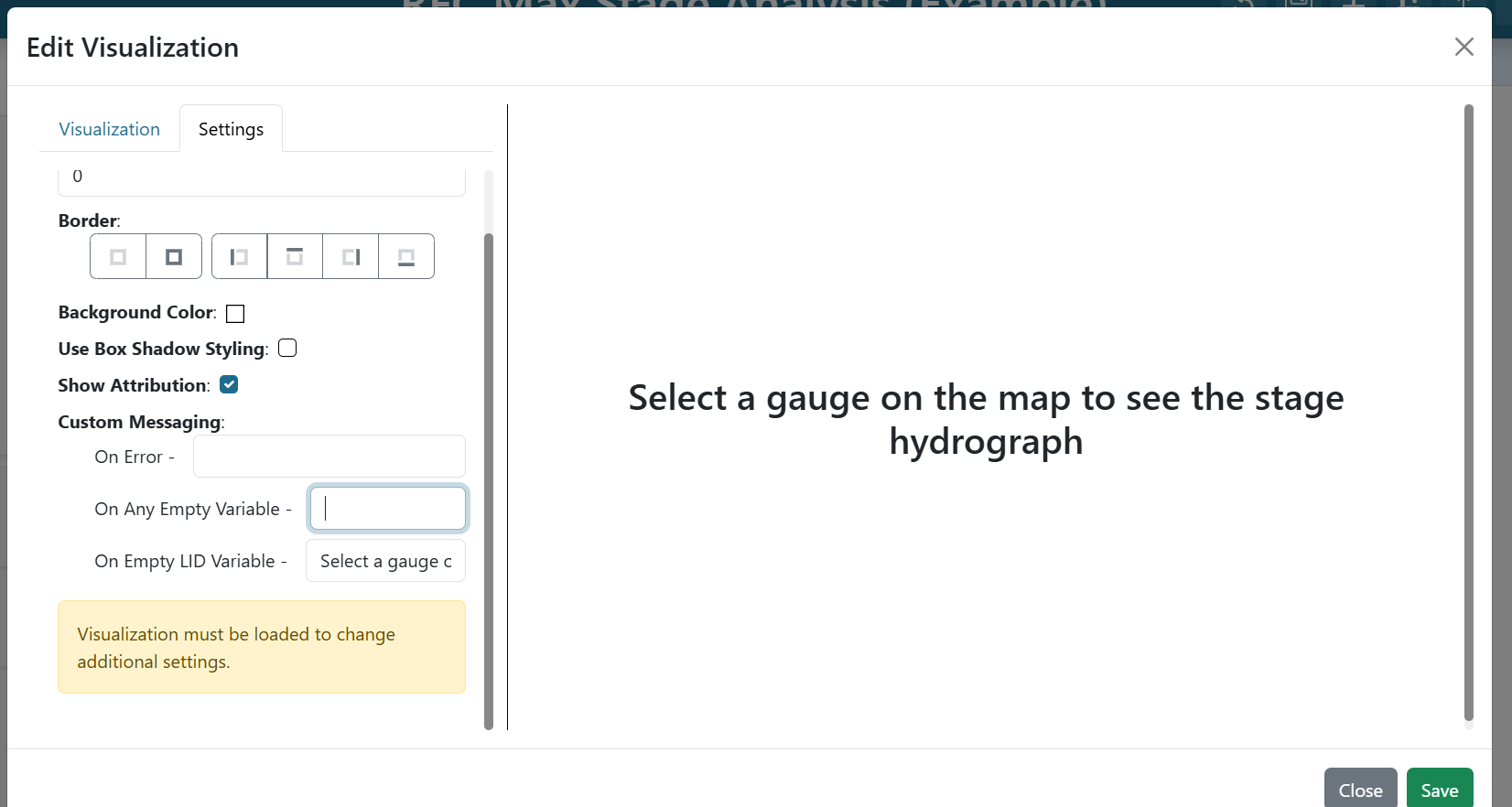
Switch to the Settings tab. Under On Empty LID Variable, enter Select a gauge on the map to see the stage hydrograph. This message will show whenever no gauge has been selected yet, so users know what to do.
Click Save.
Step 5 — Add impact statements
Impact statements describe what different water levels mean in plain language. They use the same gauge ID, so you can connect them to the same variable input.
Add another dashboard item:
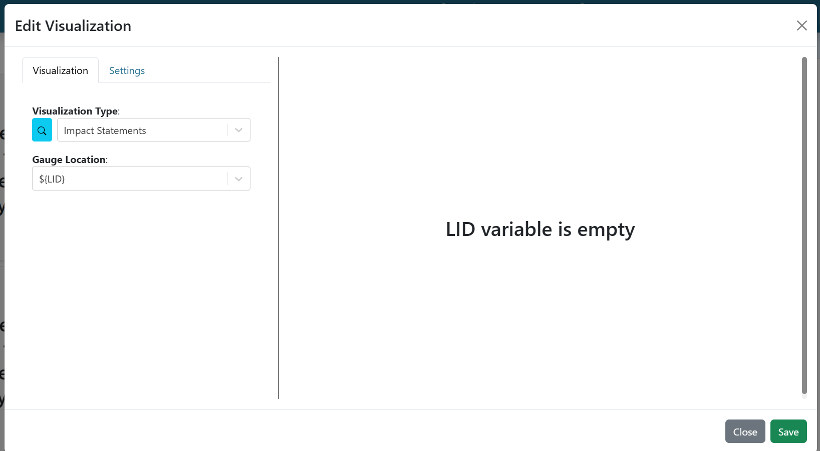
Visualization Type:
Impact StatementsGauge Location:
${LID}
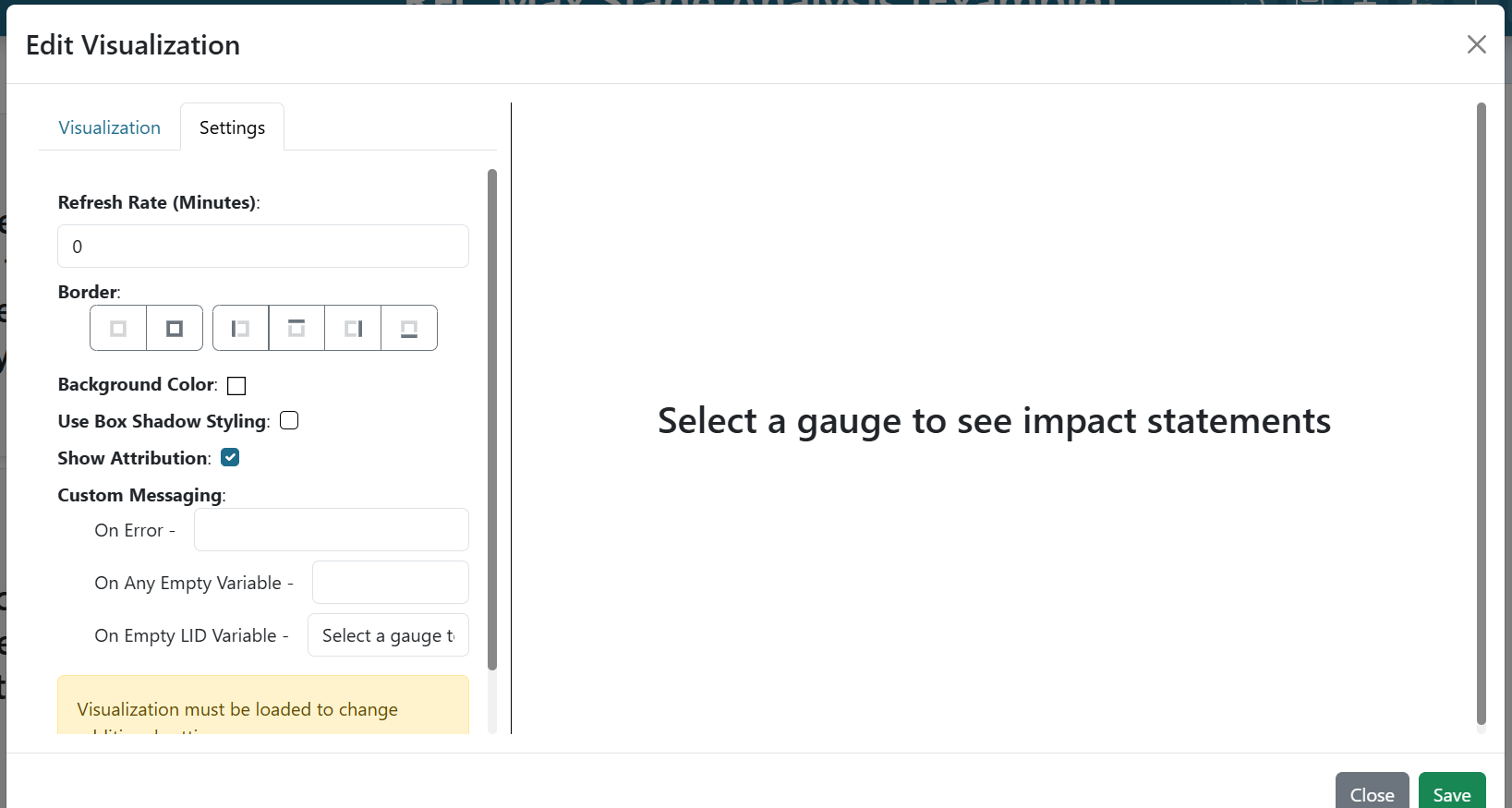
On the Settings tab, set On Empty LID Variable to Select a gauge to see impact statements.
Click Save.
Step 6 — Add the streamflow forecast
The NWMP Reaches Time Series uses a different identifier — the feature_id (a NWM reach ID), not the gauge LID. You need a second variable input for that.
Go back into the map and edit the RFC Max Forecast layer once more. On the Attributes/Popup tab, find the feature_id row and set its Variable Input Name to Feature. Save the layer and the map.
Add a new dashboard item:
Visualization Type:
NWMP Reaches Time SeriesId:
${Feature}
On the Settings tab, set On Empty Feature Variable to Select a gauge on the map to see the NWM forecast.
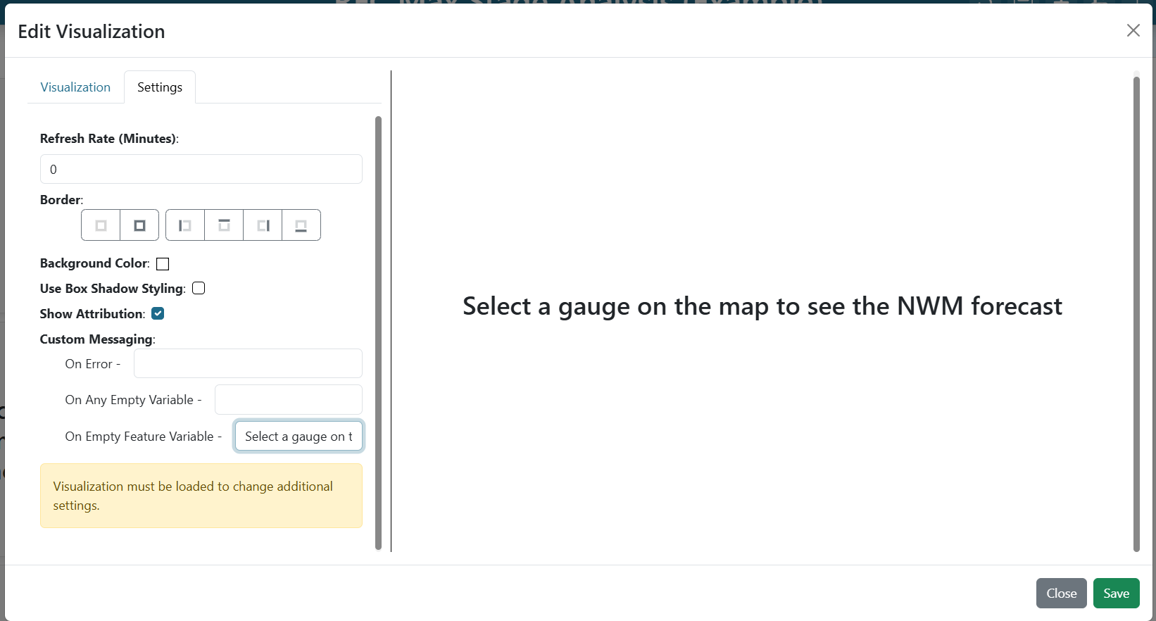
Click Save, then save the dashboard.
Step 7 — Arrange the layout
Re-enter edit mode and drag/resize each item until everything is visible at once — typically with the map on the left and the three time series / impact items stacked on the right. Save the dashboard.
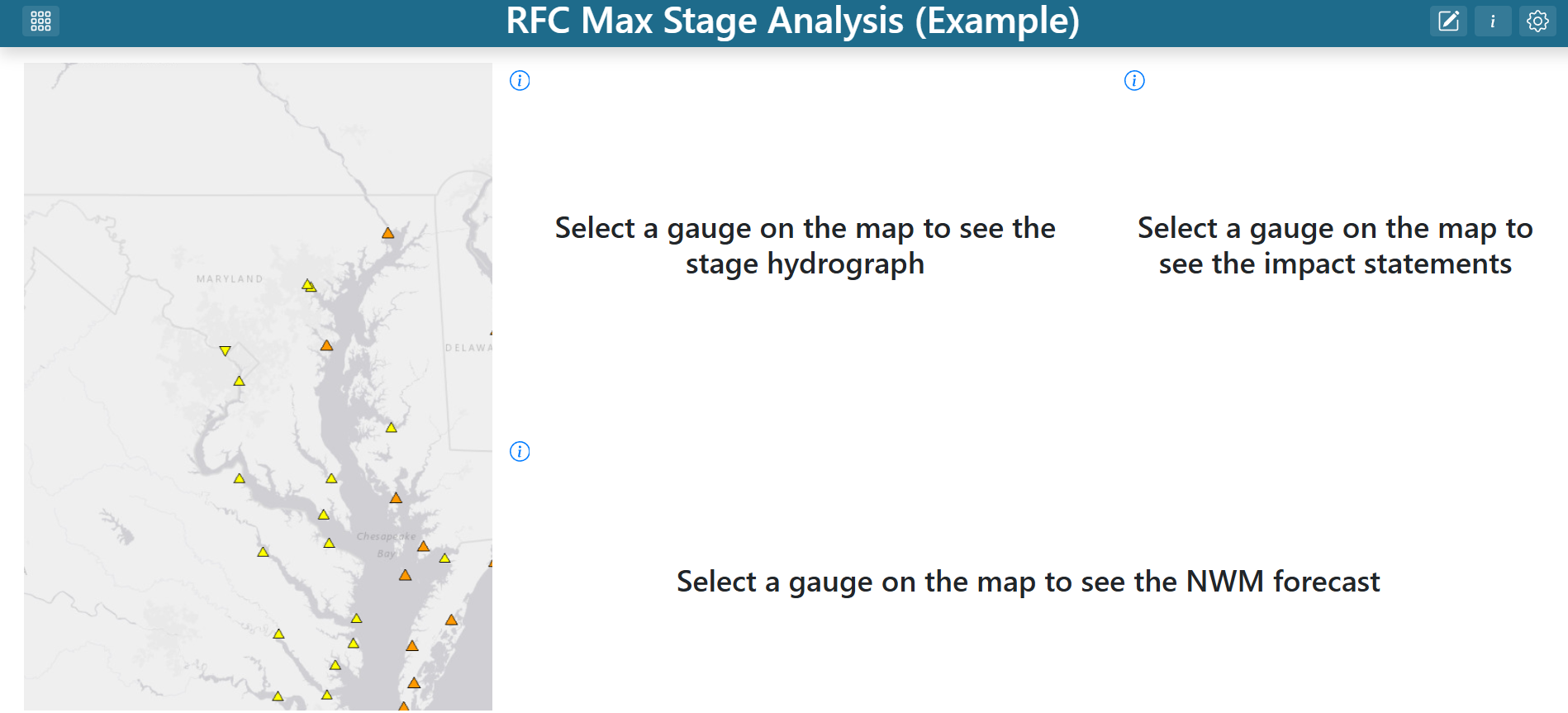
Try it out
Click any gauge on the map. The hydrograph, impact statements, and streamflow forecast all update to match the selection — because the LID and Feature variable inputs tie them back to the attributes of whatever the user clicked.
From here you can extend the dashboard with precipitation forecasts, atmospheric river tracking, or any other visualization that keys off a LID or Feature value.